Friday, August 25, 2023

A New Mission Statement


I've been treating this blog very simply; picking ephemera from the day's eBay listings, and sharing here. Usually with some input from Chat GPT, because Chat lets me have a little fun with the wording of the ads. With Chat, I’ve learned it’s not just the question you ask, but how you ask your question. You can ‘sculpt’ the answer, and the style of the answer, by the asking. Humor, drama, ad-speak, double-speak, a bit of Shakespeare...

But it occurred to me that this has never been how I write blogs. I've had several, none really profitable... but all of them were fun to write and expressed my personality.

On a separate line of thought, I wrote with the idea of using Adsense on the blog to supplement our income. When it felt ready, I applied to Adsense, and they told me the content was thin. Fair enough, I was trying to write a specific volume, without enough to say.

At the same time, the internet privacy situation has been getting scarier and scarier with tons of new laws from multiple countries, and from nearly 20 states so far with more on the way. It’s impossible to follow guidelines… whose? Which state? Which country? And none of them are straightforward. And it’s all too overwhelming.

So I’m going to post things when I feel like, about whatever feels pertinent to the theme. No Adsense, no Affiliate links. You can visit mine and Monique’s eBay stores if you want, or don’t. Doesn’t matter. The link’s there because I talk about eBay, and what I do on eBay. It makes sense that you might want to see what I’m talking about. After all, the whole idea of selling pages cut out of extremely old magazines is kind of hard to wrap your head around if you’ve never heard of it before.

I want writing this blog to be fun again. Writing for the pleasure of sharing ideas. Hopefully someone will enjoy it besides me, but if not, so be it.
With this in mind, I do have a rather esoteric change of subject (or maybe a very deep drill on the same subject) on my mind, something that nobody else seems to have noticed but has driven me mad for nearly a year. Google’s Gemini encouraged me to write about it, and I will. Next post.

Tuesday, August 8, 2023

1962 General Electric Americana 2 Oven / Ekco Flint Radiant Cookware Print Ad

    I did a nice 2-for-1 today, where I like both ads equally, but for different reasons.  The first is a full-page General Electric ad for a double range.  It's got a lot of description, and a pop of color for the oven.  It's visually appealing, and really 'sells' the product with all the text.

    The second ad is for Ekco Flint Cookware.  This one appeals mainly for the image.  If I was going to keep this ad, instead of sell it on eBay, I'd trim everything away except for the image.  I'd use the 'white space' around it as the matte, and put it directly into a deep rich polished mahogany frame.  The whole display, with her staring pensively at it, the little bird at the top... and whatever the heck those two 'sticks' coming out of the right side, done in gray tones, really catch my attention.

    On to our collaboration with Chat GPT... below is Chat's take on the New Americana '62 GE Oven.  There was so much text, I didn't get tricky with the request at first, but the output was... nice, but uninteresting.  Decided to try again, but asked for a re-write that was "florid and medieval" in style.  The result was fun, and made me laugh a couple of times.   Hope you enjoy Chat's creativity!!

Wednesday, August 2, 2023

1967 Oldsmobile Cutlass Supreme Rocket Action Car Romantic Toronado Print Ad Vtg


I couldn't resist this one.  My first car I bought after leaving home was a shiny black Cutlass Supreme, back around 1982.  It may not have had ALL the options, but it had a fair few, and might have been the best-looking car I ever owned.  I'm not a car guy, but it looked awesome.  I also nearly destroyed it within three days of buying the car.  Being a Georgia boy, I'd never driven in snow until moving to Indiana.  Was in front of a semi when we hit a patch of ice.  Started drifting to the right, I made a mild correction, started drifting to the left, another mild correction.  At that point, it went into a multi-360 spin and there was no chance of correcting any more.  

A couple of times my friend and I were looking straight into the eyes of the truck driver behind us, while he was staring right back.  Still spinning, we eventually skidded off the road, and the trucker kept on going.  A nice guy behind him stopped, and he happened to be driving a truck with a winch.  As we were hooking his chains to our car, he told us he saw the whole thing and thought the semi was going to flatten us.

    My friend John was calm and collected the whole time.  The first two times we started drifting, he warned me "You're gonna lose it, Alan."  Both times I said "I know, John."  When we started spinning wildly, all he said was "You lost it, Alan."  I said "I know, John."  Those were the only words spoken until we came to a full stop and stepped out of the car.

    Ultimately, the only damage the Cutlass took was the loss of one hubcap.  Plus it looked like we'd been mud bogging.  I guess when you go through that much excitement with a car, you get attached to it.  It really was a great car!!

Thursday, July 27, 2023

1967 Bold Detergent Sudsing Power Dirt Bright Clean White Sho Nuff Print Ad Vtg


I nearly decided not to list this ad due to the page damage... but I love this particular ad campaign.  It's clever, funny, and will certainly be offensive to somebody.  Not that I'm trying to be offensive, but it does make me laugh to see how society changes over the years.  I was almost 7 years old when this printed, and nobody thought twice about whether the text would bother anybody.  
    We've come a long way since then.  For the most part, I like the changes.  Being more thoughtful of others, being polite, letting everybody make their choices... those are good things.  It's a shame that we couldn't have stopped at "let's all be tolerant of each other."  Seems like there are too many vicious, vindictive people who think freedom of choice and expression are wonderful things, as long as it's "them" making the choice for the rest of us.  
    Seems kind of willfully blind to insist nobody can steal their freedoms, but not realize that's exactly what they're doing to everybody else's freedom to choose.  I'm old, and getting older, and don't expect anybody to listen to me.  But I'm still gonna say what I think, before someone tells me I can't.  Feel free to disagree, we can still be friends.

    Climbing down from my soap-box now.  Didn't mean to get serious, but since I did, I'll just leave it up there. For more fun, here's another collaboration with Chat-GPT.  This time, in an effort to reduce the 'boilerplating' that's becoming apparent, I asked GPT to turn the original text into something "thoroughly new and unique."  So, the first word I get... is "Unique".  How stereotypical.  I get exactly what I ask.  :^)
    Setting that aside, the text is definitely more of an "up-mix" than the previous posts were.  I like what GPT did.  It veered away from an accurate rewrite, but the result is interesting, exciting, and funny.  My favorite element is when it changed "Sho' nuff" from a quote, to a bold, assertive colloquialism.   I'll get out of the way and let you read GPT's version now.
Enjoy!

    Unique eBay Listing: "Revolutionary Cleaning Power! Get Clothes Bright with Bold Detergent - Vintage Print Ad from 1967"

    Discover the magic of Bold Detergent - a true game-changer in the world of laundry! This vintage print ad, with a touch of humor, captures the essence of Bold's sudsing prowess and its ability to transform your clothes beyond just clean and white – all the way to bright!

    Sho' nuff, Bold is up to the challenge! Say goodbye to old-fashioned detergents and the hassle of feuding and fussing with laundry. Bold's power formula, packed with blue, green, and white granules, kicks out dirt like never before, delivering not only white whites but even bluer blues and stripier stripes!

    Featured in a full-page, color display in the April 1967 issue of Better Homes and Gardens, this original advertisement showcases the regulated sudsing of Bold, ensuring an effective cleaning process that powers out dirt while ushering in unparalleled brightness.

    Despite the age of the magazine, this page has been meticulously scanned to preserve its nostalgic charm. Please note that due to its vintage nature, there might be some foxing, fading, and discoloration typical of older paper items. Additionally, the page bears slight corner/edge damage and ripples.

    This unique piece of advertising history is suitable for framing, and it's a true testament to the sense of humor prevalent in the 1960s. Although the page experienced deep creasing during shipping, it remains an extraordinary find for collectors and vintage enthusiasts.

    The images provided are exact representations of the page you'll receive. Detailed scans have been taken to give you a clear understanding of its condition. Rest assured, your satisfaction is guaranteed!

    Step back in time and embrace the spirit of the 1960s with this Bold Detergent vintage ad. Bring a touch of nostalgia to your collection, home, or office décor. Don't miss out on this charming piece of history at a reduced price, reflecting its unique condition. Act now and seize this opportunity!

Tuesday, July 25, 2023

1967 Admiral Color Big Picture TV Easiest Tuning Ever Remote Control Print Ad


I liked this ad mainly because of the comparison between the TV's they had in 1967, versus how far we've come since then.  Makes me wonder how different they'll be by 2067?
    Again, I've collaborated with my friend Geppetto (Chat GPT).  It's become apparent, given a similarly-phrased request, GPT will create pretty similar text from one ad to the next.  I originally asked for improved grammar and flow, but the changes were almost unnoticeable.  Next I asked for a friendlier and smoother read.  
    Finally I asked GPT to improve the grammar and flow, making it read easier and friendlier, but to completely re-word the text.  

    The result might be a little over the top... or somewhere off to the side.  But it was fun to see where it wound up.  It makes me think of those old tv commercials.  Especially the "But there's more!" 
Read below and see what you think.  Might not be what I'd write for myself, but it's fun seeing what the AI will do.


Vintage 1967 Admiral Color Big Picture TV - Easiest Ever Remote Control Tuning! Perfect for Framing!

Ad Description: Step back in time with the remarkable 1967 Admiral Color Big Picture TV, offering the easiest tuning experience ever!

Imagine immersing yourself in the grandest color TV picture, made possible by two remarkable Admiral features. First, there's the exclusive Admiral Hideaway Control Center, adorned with Touch-O-Matic Power Tuning, concealed behind a touch of golden elegance! With a simple finger touch, you can tune into your favorite color shows anytime. The clever design keeps your two most-used controls - the push-button tuning bars - conveniently accessible. Just touch the upper tuning bar to switch channels, or the lower one to power on/off and adjust volume. Thanks to Admiral Power Tuning, it all happens effortlessly! And when you're not tuning, the door glides gracefully into the cabinet, adding a touch of fine-furniture beauty to your TV setup.

But there's more! Introducing the revolutionary Admiral Color Sonar - a full-function remote control that empowers you to turn the Admiral Color TV on and off, adjust volume, change channels, and even control color intensity and tint, all while lounging in your easy chair! Its precision in tuning surpasses that of the TV set itself, making it truly exceptional. Experience for yourself why Admiral boasts the easiest tuning ever.

Admiral Color has earned its reputation as a mark of quality throughout the world since 1967. This vintage ad originally appeared in Better Homes and Gardens magazine, adding a nostalgic touch and capturing the essence of a bygone era.

Publication Date: April 1967 Publication Name: Better Homes and Gardens Magazine Size: Approx 9.5” x 12.5” (May be slightly smaller after pages are trimmed from the magazine)

Unlock the past and add a touch of history to your home with this framed vintage Admiral Color Big Picture TV ad. It's not just an advertisement; it's a piece of delightful television heritage. Grab this rare find and relive the golden age of television with unparalleled ease and style!

Thursday, July 20, 2023

Vintage 1967 Kleenex Tissue Foldout Centerfold Print Ad - A Beautiful Nostalgic Find!


Still having fun with Geppetto (ChatGPT).  The results are very directly influenced by the way I word my request.  This time I asked him to edit my eBay text into a smooth and easy to read article.  It was kind of "smooth plus", because this wasn't just edited into a flowing text, it was "smooth" like a high-dollar commercial campaign.  I'm impressed.  
    I also did some editing.  Seems like some minor 'liberties' were taken, and needed to be brought back in line for better description accuracy.

Edited by Chat GPT from the original eBay listing:
Step back in time with this charming and unique vintage find – a double-sized foldout print ad from April 1967, featuring the iconic Kleenex Tissues. Delight in the nostalgia as you explore the beautiful world of softness that Kleenex brought to homes decades ago.

This foldout ad is a true treasure, with a "teaser" page on the external side and a partial article about insurance. On the outer page, is a model styled up in 1960's elegance.  It reads "Excuse us while Kleenex tissues slip into something..." As you unfold it, you'll reveal a double-sized centerfold showcasing the captivating model, with the word "beautiful" and three exquisite Kleenex box designs.

The ad proudly displays Kleenex tissues in three gorgeous new decorator boxes, perfect for adding a touch of elegance to any space. Softness and sophistication intertwine, making these tissues not just practical but also a beautiful addition to any room.

Please note that the magazine has aged gracefully, bearing the marks of time with foxing, slight fading, and discoloration, as expected of vintage paper items. Some minor corner and edge damage, as well as gentle ripples, add to its authenticity.

Rest assured that the images you see are the exact pages for sale, meticulously scanned on a black background to preserve their vintage charm. I've taken detailed scans, so you can examine and make your own judgment.  Given the complexity, and difficulty of describing how the page folds, I also made a video of this one so you can see the pages turn and how it all fits together.

Though the top and bottom outer corners show a slight bend, the allure of this unique piece remains intact. Additionally, the left edge of the "beautiful!" page may be slightly darker, a testament to its exposure over the years. Despite these slight imperfections, it's a remarkable item that exudes the charm of a bygone era.

Own a piece of history and add a touch of vintage beauty to your collection! Your satisfaction is guaranteed, so seize this opportunity to relive a nostalgic moment with Kleenex Tissues and their captivating decorator boxes.

That's it for GPT.  Back to me, now:
    The description was very 'smooth sales'... my original descriptions tend to be more blunt, mainly because I'd rather make it sound worse and have people be pleasantly surprised, than have customers upset because it's not as described.  I mostly left GPT's work "as is", because it gave me a chuckle to see how it smoothed out my own writing.
  I had a hard time figuring out a good way to describe the single-page, double-sized, foldout/centerfold physical aspect of the ad.  It's unique (to me at least), and the first time I've listed one like it.  So I kind of opted for overkill on the descriptions, plus a video for the explicit purpose of showing physically how the ad is laid out.  For as long as the ad is active, you can click on the ad image above, and see the actual eBay page (and video).

Friday, July 14, 2023

1967 Baldwin Piano Music Facet Clear Vibrant Tone Joy Light Responsive Print Ad


     So, still playing with Chat GPT, whom I affectionally refer to as Geppetto.  Gave it my eBay description, and the below text is the response.  I do still have my own bit to ad, because Baldwin is near and dear to my heart, and to my childhood, so please continue to read after Geppetto's text!  :^)

From Chat:
This vintage print advertisement from 1967 showcases the iconic Baldwin Piano & Organ Company. The advertisement, originally featured in Better Homes and Gardens magazine, is a full-page, black and white piece suitable for framing. Measuring approximately 9.5" x 12.5", this interior page captures the essence of Baldwin's musical excellence.

The ad highlights the remarkable qualities of the Baldwin piano, emphasizing its ability to add a new facet to the life of any music enthusiast. With its clear and vibrant tone, the Baldwin piano promises to deliver a joyous listening experience. The instrument's light and responsive action further enhances its appeal, making it an ideal choice for beginners and seasoned players alike.

The advertisement conveys a sense of long-term value, suggesting that investing in a Baldwin piano ensures that the player won't need to consider an upgrade in the future. It speaks to the growth and development of the pianist, acknowledging that while she may be a beginner now, she will eventually reach a level of expertise where she'll appreciate the quality and craftsmanship of her Baldwin piano.

The ad also proudly mentions Baldwin's official sponsorship of the 1967 Universal and International Exhibition held in Montreal, Canada, solidifying the company's reputation as a trusted and prestigious brand in the world of pianos and organs.

With its nostalgic appeal and historical significance, this original advertisement page offers a unique glimpse into the musical landscape of the late 1960s. Whether you're a collector, a music enthusiast, or simply appreciate vintage memorabilia, this Baldwin piano print ad is a captivating piece of history that deserves a place in your collection.

Now back to me...
    Having read Geppetto's rewrite of my eBay listing, it's worth noting that the emphasis of the ad text is pointedly about "Your little girl."  Kind of makes me feel left out, because when I was about 6, in 1966, my parents bought a Baldwin piano for me.  Piano lessons were MANDATORY... Dad was military.  They asked my opinion before buying the piano.  In my 6-year-old innocence, I agreed that "sure, I'd like to learn how to play the piano."  That answer resulted in me repeating 3 years worth of first-year lessons...  not many people can say they were sent back to start over 3 times in three years.

    The rest of this blog felt more appropriate in my Southern Gospel Music blog, "Grace Notes" so I finished it over there.  Click this link to discover how I wound up taking the same lessons over... and over... and over!

Thursday, July 13, 2023

1967 Ethan Allen Treasury American Traditional Custom Room Furniture Print Ad (Plus SealTest Ice Cream)

Yes, this page is
very wrinkled!
 The primary ad here is Ethan Allen.  It's full page, in color, and has a clever comparison.  On a mostly white background, two small photos.  The top one, a bare room with deep yellow walls.  The bottom image, same room tastefully furnished with the best of Ethan Ellen, as recommended by their highly trained Ethan Allen decorators.  From "dreary dud" to "Decorated Den".

    My first impression was that the before and after was achieved purely by adding the perfect selection of furniture to the room.  On the second look, it becomes apparent that they've at least changed the floor as well.  Pretty drastically - from boring and bleah, to a deep reddish-orange that sets off the new furniture.  I'm of two minds about the wall.  Either, its the same wall with no re-paint, but looks deeper orange in contrast with the additional furniture... or they've repainted the wall with a similar, but richer, color.

    Either way, it's a big improvement.  Especially when you read the text below, and understand how MANY things are hidden out of sight due to the clever built-in storage capacity of the furniture in the room.  That impressed me even more.  They're keeping a hi-fi set, 300 records, 2 loudspeakers, a ham radio transmitter and receiver, a tool chest, 135 books, 29 favorite pipes, a fully-stocked bar, and a lot of games.  No matter how I look at it, it doesn't look like that many things could possibly fit so neatly in that space.  Kudos to Ethan Allen.

    But... if you know me, you know I'm not all that excited about a furniture ad.  It's the opposite side that holds my attention.  Not so large, it's only a 3/4 page ad, but it has very rich, eye-catching colors.  This is actually one of my favorite ads, it's not the first time I've run across it, not even the 2nd, but it's the first time I 100% agree with their "Ice Cream for Husbands" claim.

    The first couple of times I ran across the ad, the whole marketing campaign appealed to my sense of humor, particularly as it compared with modern attitudes.  The ad is targeted at wives, the person doing the shopping, but works to convince her this is a "manly" ice cream, for manly men.  Only guys that prefer beef stew to bouillon meet the standard.  If your husband is manly enough, this is the ice cream to get him.  It's 60% creamier than ordinary ice cream.  Sealtest Prestige French, the creamier ice cream.  The ice cream for husbands... but their point was flawed by the presentation.

    As funny as it was, and as much as the 50-years-later humor appealed, the one thing that ruined it was the flavor.  The other times I saw this ad, it showcased Strawberry ice cream.  And really, strawberry ice cream just doesn't seem like a manly flavor.  Strawberries are soft; they're... pink(-ish).  Somebody in Sealtest goofed.  This ad fixed that.  It's like adding the cherry on top of an all-chocolate banana split.  The ice cream showcased in this one... is "TRIPLE CHOCOLATE".  When you read that flavor, it's like there's a background narrator saying Triple Chocolate in a deep, resonant masculine voice.  This has got to be the most masculine ice cream flavor ever, and now I'm craving it.  Not sure if it's still in production all these decades later... but I hope so.  :^)

Wednesday, July 12, 2023

1967 Bolens Lawn Keeper Arnold Palmer Compact Tractor Riding Walking Print Ad (With a little help from Chat GPT)

I was feeling tired and uninspired, but liked this ad. Arnold Palmer was in his prime while I was still in grade school, so my memories are of an 'older' Arnold. This image catches my fancy, because it shows an Arnold I never got to see. He looked pretty rugged, even perched on that sized-small lawn tractor.
I wanted to do him justice, so looked to Chat GPT for help. (For convenience, GPT allows me to call him Geppetto.) Anyway, Geppetto looked at my ad copy, and came up with (mostly) the text below. Some of the things Geppetto wrote were innocent assumptions based on a lack of context with human referents. So, I touched up Geppetto's writing. The result is a collaboration. My original description from the eBay listing, Geppetto's creative re-write, and my final edit.
It was a fun little project, and depending on my mood and the subject, I may ask Geppetto for input on other posts. I'll always let you know when I do... not going to steal credit when anybody helps me, even an AI. :^)
    The 1967 Bolens Lawn Keeper Ad featuring Arnold Palmer takes you back to the golden era of lawn care. This eye-catching advertisement, suitable for framing, showcases the Bolens Lawn Keeper, a tough and reliable machine that promises to revolutionize your yard maintenance.
    At the top of the page, in bold letters, you see the name "Bolens Lawn Keeper," accompanied by the tagline "... tough act to follow.", and Arnold Palmer's "signature." The combination of bold typography and vibrant colors immediately grabs your attention. 
    In the center of the ad, a larger-than-life image of the legendary golfer Arnold Palmer confidently sits on a Bolens Lawn Keeper compact tractor. With a friendly smile Palmer makes the Bolens Lawn Keeper look like a fantastic way to manage your lawn care. This endorsement from a sports icon adds a touch of prestige to the product, suggesting that it is a winner both on and off the golf course. 
    Below the image, the ad highlights the versatile capabilities of the Bolens line of products. It emphasizes that it's not just riding mowers but also walking power mowers, tillers, and snow casters. The Lawn Keeper compact tractor is designed to handle various tasks, making it a practical choice for homeowners who value efficiency and convenience.

    The publication date of the advertisement is April 1967, and it was featured in Better Homes and Gardens magazine. Known for its focus on home improvement and gardening, this publication is the perfect platform to showcase the Bolens Lawn Keeper, appealing to readers who take pride in maintaining beautiful outdoor spaces. 
    Overall, this full-page, color advertisement captures the spirit of the era with its vibrant visuals and the endorsement of Arnold Palmer. It presents the Bolens Lawn Keeper as the ultimate solution for all your lawn care needs, inviting you to experience the power and performance of this remarkable compact tractor.

Tuesday, July 11, 2023

1967 Eastern Air Lines Child Memories / Yard Man Saddle Mustang Mower Print Ad

     Today's featured vintage ad is a bit backwards.  When there's a full page ad on one side, and a partial page ad on the other, usually the full page ad is the center of attention.  In this case, the full page ad is for Eastern Air Lines.  The page header reads "Give your children some memories that won't wear out."


    That's fine as far as it goes, but maybe a bit dull.  Not worthless. I'm sure the ad has value. Maybe to the advertiser, maybe someone who went on a trip because of this ad, a historian, or plenty of other possibilities.  But really, how in the world can you compete with the 'other side' of the page? Compare the two thumbnails... one immediately stands out, doesn't it?

    The Yard-Man Mustang, 1967 model. On a bright background shading from dark orange to light orange (an effect known as Ombre) is a yellow Mustang and a mean-looking Hombre.  :^)
    Actually, a fancy-looking dude/cowboy wannabe holding his color-matched saddle and about to 'tack up' his Yard-Man Mustang riding mower.  The headline reads "Saddle a Mustang...and Go!"  Of course it does.  In the world of cheesy titles for a cheesy image, it's the only title that makes sense.

    For sheer chutzpah... for completely self-aware cheekiness... for being able to poke fun at yourself, and your product... I absolutely love this ad.  The instant I first saw it, it made me smile.  It tickles my funny bone.  It's memorable.  Attention-getting.  Intentionally ridiculous.  Yard-man absolutely nails advertising.  They understand how to stand out.  As a completely unbiased viewer, with no preference or interest in either company, the Yard-Man ad sings.  I'll forget the Eastern Air Lines ad, which is ironic since their point is to give your child a memory that won't fade away.  But the Yard-Man ad is like a good joke, well told.  Always worth a chuckle.  If I randomly think about mowing the lawn, or using a riding mower, this ad's going to pop into my head for a long time to come.  

    To the Yard-Man advertising team, I sincerely hope you won some kind of award for that ad.  Knocked it out of the park!

Yard-Man 1967 Mustang for the win!!


Wednesday, July 5, 2023

Taking a Vacation to test eBay full time

    I haven't been posting a lot here.  My goal is to pick one Vintage Ad listing from each day and feature it here, but the reality is... more likely going to be twice a week.  It's not that eBay isn't going well.  Actually, it's been doing great recently.  I'm still working part time at the paper, but getting ready to transition to full time on eBay.  For some time now, it's been mornings at the paper, and afternoons on eBay.  Recently, normal life has been taking more of my time, and eBay is suffering a bit for it.  

    Most of those things should be slowing down over the next month or so.  Bit by bit we're catching up on out-of-the-house tasks.  I've taken a week of unpaid vacation for a trial run of "life after work."  Aside from a couple of hiccups, it's going great.  My best afternoon ever, I listed 10 Vintage ads.  Usually it's closer to 6 or 7.  On Monday, my first full day, I got 13 +1 for the day.  The +1 is a result of lots of discussion and planning.  I love listing vintage ads, but they sell really slow.  Monique usually lists the 'normal' stuff, or the extreme items that are bigger ticket than our usual run.  

    So our compromise plan is for me to list one item per day, of ordinary things.  Traditional items, like toys, gadgets, things from garage sales.  Since we're also trying to minimize, I've been using my +1 to list things I love, but don't need need to keep any more.  Collectibles that are great, but that have been stored in boxes, kept in the shed, not where they can be appreciated.  My first +1 this week was a 30-year-old Trigun action figure.  It's difficult to let go... but he's been in storage so long I forgot I had him.  Same with the Snake Plissken Escape from LA action figure, and the Classic Batman.  Not thrilled about selling them, but it's time to be harsh.  If they're not on display and being appreciated, it's time to move on.

    In the meantime, the rest of the day is for vintage ads.  Monday I listed 13, which is 3 better than my best until then.  Yesterday was the 4th of July.  Listed my +1, got a few non-eBay things done, talked with friends.  This was not according to plan, but we knew up front there would be days that wandered adrift. Today, did the +1, and 16 ads!  Again, a new personal best.  

    Even better, Monique's eBay store and mine are both doing very well.  eBay's been slow for a while, so it's great to see Monique's listings do well.  Her store is our mainstay.  The ads I post are slow sales, and I've been focused on building quantity, and reputation.  I try to be very up front with condition, and go for overkill with the careful packaging.  

    Also, and I can't find anybody else selling ephemera who does this, I scan both sides of the magazine page (or pages), and include the images.  Even if there are no ads on the back side, it makes sense that people would be curious about both sides.  In some cases, there are very cool ads on BOTH sides.  Depending on just how cool, I'll either feature a main one, but still describe the other side, or split the title between both ads.  This includes creating a custom thumbnail for the lead image.  If it's a two-page ad, that means I'm actually scanning and describing four pages.  More, in some cases... Garcia fishing/hunting equipment had a 6-page ad rambling through an Outdoor Life magazine!

    I do worry that maybe this extra effort is a waste of time, but if I was my own customer, this is what I'd like to see.  Full disclosure, no questions, and the comfort of knowing exactly what I'll get when I buy.  Plus, who knows which ad's going to sell?  If I only featured one side, I might be choosing the wrong one to list.

    Back to the job transition - I've been with the paper for 15 years.  About a year ago, it got to be too much and I dropped to part time.  Over this last year, working with Monique in the afternoons has been really great.  We laugh, joke, ask each other's opinions on the things we're listing.  We're spending more time together, and I've seen a shift from high-stress to being happier.  Our income is minimal, but as long as we keep pushing on eBay, things look pretty good. At this stage, leaving the paper to work full time with Monique feels like a natural progression.  A positive direction for us to move in.

    The only downside is the friends I'm leaving behind.  After all these years, many of my co-workers are good friends (more like family), and I'll miss them.  Monique suggested once or twice a month that we can bake cookies for me to take to the office, giving me an excuse to hang out and keep in touch.  All my co-workers like the idea.  If you've ever tasted Monique's cookies (including the holy grail... homemade Macarons), you'd understand why everybody thinks it's a great idea. :^)

    Even with that, I struggle at the thought of not getting to see everybody as often.  It's going to be difficult to leave that part of my life behind.  But more so, exciting and fun to be working at home, spending most of my days with Monique (and our puppies).  We keep talking, making plans, trying to balance work versus 'retired'.  My main goal is to work hard, but happy.  Not to be rigid with our planning, but responsible.  To know that some days we'll be working more, and some days we'll have unplanned time off.  I want to leave the work stress behind, and enjoy life as much as possible.  It's a work in progress, but we'll figure it out.  It's honestly an exciting time, and I'm looking forward to it.

1967 Mercury Cougar XR-7 The Mans Car / MayTag Washer Dryer Dependable Print Ad

     We have a fun juxtaposition this time. Over and over, I’m astonished by the attitudes and stereotypes in these older ads. What makes these two so fun, is that they’re literally each the flip side of the same page. On one side, you have Mercury, the “Man’s Car.” On the other side of the page, there’s a Maytag washer/dryer ad targeted at entire generations of housewives.

    Starting with Maytag, they’re featuring poor Mrs. Dubler, who’s managing a family of 10 children (plus her and husband). At 6 years old, she figures her Maytag washer and dryer are just getting broken in, with lots of life left in them. At 4 loads each day, every single day...and in six years, they’ve only broken down once. :^)

    She has reason for her positive outlook, because her mother’s Maytags are 39 years old and still working. (I guess, so is her mother.) They don’t really spell out what kind of workload her Mom has, though. No telling if it was an equally large family, or if her mom only had the one child. But hey, let’s just keep things rolling. It looks like about a half dozen of the current children are girls, so Maytag’s got an inbuilt and expanding customer base for the years ahead.

    The ironic part? The ad mentions newer Maytag models with features that Mrs. Dubler’s washers and dryers lack. Like giant new washing capacity. You’d think, for the advertising street credits, Maytag would make a point of donating some of the newer machinery to this robust family. Maybe Mrs. Dubler might be pleased with only having to wash twice every day?? Guess they figured her husband can afford all those kids, let HIM buy new ones.

    Now lets talk about that Mercury. You know, the “Man’s Car.” All kind of luxury features. Elegance galore, soft glove leather, walnut-grained vinyl panels. Dials, overhead console, hidden headlights, powerful V-8 engine. All standard. Cause you know, he works hard to buy his wife those Maytag washers and dryers. He deserves his “Man’s Car.”

    Last point – not sure when the term came into use, and this was probably before then, but this Man’s Car is the Cougar XR-7. So, while his wife is busy raising ten rambunctious youngsters, the “Man” is relaxing with his “Cougar.”

    Since I started selling vintage advertising on eBay, there’s been an awful lot of very blatant sexism and stereotypes. Some even more extreme than this. But the pure irony and accidental serendipity (I know, that’s redundant) of having these two ads back to back on the same exact page… that’s priceless.

    I usually include the main text from the featured listing, but it's pretty much all been covered already.  Don't think it's needed this time.


Monday, June 26, 2023

1967 North Carolina Pirate Stash Booty Blackbeard Calico Jack Print Ad Vintage

     I like when travel advertisements think outside the box.  Most of them just play up the natural features and benefits, which is completely fair.  A few get creative with their descriptions, maybe some humor.  Then there's North Carolina.  This is brilliant - they invite you to come dig for buried pirate treasure!

    Right off the bat, they use humor (and a bit of greed) to pull you in.  So, maybe nobody's found any pirate treasure yet... that might just mean the odds of somebody finding something are getting better and better.  After all, the North Carolina Coast was home stomping grounds for the likes of "Blackbeard, Calico Jack and Gentleman Harry."  There ought to be some treasure somewhere.

    If that's not enough to catch your interest, the modern photo of an old-school pirate is totally awesome.  Certainly made me stop and look.  As a matter of fact, it made me think we might keep this one here at home.  Monique and I enjoy building models.  Mostly, she does monsters and villains, and I do super-heroes.  Her current (and long-running) project is a pirate. He's a work in progress.  Before I even decided to post this ad on eBay, this image struck me as a perfect backdrop for her pirate.  Showed it to her, and while she liked it, it wasn't close enough to the pose her pirate is standing in.  She's going to look online for better match for her pirate, which leaves me free to list this one on eBay.

    So, this pirate nearly found a permanent home before he ever went on eBay.  Hopefully someone will find him as fascinating as I did, and give him a place in their collection.  :^)


Original Advertisement Page Placement:
 Interior
A single page, with both sides scanned and described.
Suitable for Framing
Ad Description/Company Name:
Side 1: Full Page, Color
North Carolina
(A pirate-themed travel ad)
They say pirates stashed enough booty along our coast to ransom a score of kings.
So far, no one has found any, but you are welcome to join the search.

Side 2: ½ Page, Black and White
Better Homes for All America
Better Homes Project Plan 3302-1
Don’t be satisfied with the makeshift – here’s the real utility!

Publication Date: March 1967
Publication Name: Better Homes and Gardens
Magazine Size: Approx 9.5” x 12.5” (May be slightly smaller after pages are trimmed from magazine)
Condition: Used.
These are very old magazines; foxing, fading, and discoloration may be present with older paper items. Minor corner damage and slight ripples may be present.
These are original pages taken from their original magazines.
Images are scanned on a Black background.
The images you see are the Exact same page being sold. I take detailed scans of each one, please examine and make your own judgment. I’ll also include notes of anything out of the ordinary.
Your satisfaction guaranteed!
Specific Condition Notes: This entire particular issue – March, 1967, was bent diagonally on the upper inside corner before it was ever disassembled. It’s very hard to see in the scans, but is present on nearly every page, including this page. Additionally, this page is somewhat rippled.
The price is reduced to reflect the condition.

Friday, June 23, 2023

1967 Sealtest Prestige French Ice Cream Husband / Canada Centennial Print Ad VTG

     Let's get the ugly truth out of the way first.  This page is not in excellent condition.  As a matter of fact, I was of two minds whether to list it or not.  It's heavily rippled, you can see it clearly even in the reduced image here.  Not so visible on the image but still present, someone bent the whole magazine on the upper corner near the binder.  I listed it for several reasons.  

    First, we bought this collection of magazines, and it was an investment I don't want to waste.  Maybe, if I'm honest about the condition (I spell page conditions out clearly, in two separate locations within each listing), and if I provide a discount, there might be someone willing to overlook the damage for a specific ad.

    Second, I've only been listing these for a few short months, and every listing I make is more practice to do a better and faster job.  In less than two months, I'll be fully retired from my job of the past 15 years, and working on these full-time.  By that time, I hope to hit the ground running.

    Third, I've discounted the usual cost, and all these listings have a "make offer" option.  I would rather make the sale at a discount or even small loss.  Again, for the sake of gaining experience in the workflow.  All in all, it's not wasted, it's been a learning process in improving efficiency.

    That said, this ad is a favorite of mine.  It's funny, given the context between 1967 and today, to see how attitudes have changed.  Sealtest is targeting WIVES as the shoppers in the family, but telling them this is a fantastic ice cream for their "manly man" husbands.  Hearty.  60% Creamier.  A "special ice cream for your special man."

    It's also a good-looking ad.  I love ice cream, which doesn't hurt.  But even the hands tell a story.  Her hand is exquisitely manicured, with soft pink nail polish... which also matches the flavor of the ice cream.  His hand is strong, powerful, with a manly ring (with a big stone), and gripping that spoon like it's a weapon.  I bet he even prefers roast to rarebit.  The overall colors are warm (so to speak) and appealing.

Not subtle, Sealtest.  But credit where it's due, I bet this was an effective ad in its day.

The opposite side was a good ad in it's own right, but this one just swept me away.  

Ad Description/Company Name:
Side 1: ¾ Page, Color
Sealtest Prestige French Ice Cream
If your man prefers roast to rarebit,
serve him the ice cream that’s 60% creamier.
An ice cream for husbands

Side 2: Full Page, Color
Canada’s Centennial is a great, wide, wonderful world.
Publication Date: March 1967
Publication Name: Better Homes and Gardens
Magazine Size: Approx 9.5” x 12.5” (May be slightly smaller after pages are trimmed from magazine)

Condition: Used.
These are very old magazines; foxing, fading, and discoloration may be present with older paper items. Minor corner damage and slight ripples may be present.
These are original pages taken from their original magazines.
Images are scanned on a Black background.
The images you see are the Exact same page being sold. I take detailed scans of each one, please examine and make your own judgment. I’ll also include notes of anything out of the ordinary.
Your satisfaction guaranteed!
Specific Condition Notes: This entire particular issue – March, 1967, was bent diagonally on the upper inside corner before it was ever disassembled. It’s very hard to see in the scans, but is present on nearly every page, including this page. Additionally, this page is heavily rippled.
The price is reduced to reflect the condition.

Friday, June 16, 2023

1967 Heftier Chase Sanborn Hot Coffee Perk Blended Cup Cheer Print Ad Vintage

    Today I listed a vintage print ad for Chase & Sanborn coffee. I hadn't heard of them before, but they had a clever ad showing a young couple in the aftermath of a children's birthday party. Her kneeling on the floor with dustpan and whisk broom, smelling the heavenly scent of coffee after a harrowing day. Him pouring the just-made coffee, two cups on the table ready to revitalize the worn-out couple.

    It was a cute ad, but what really got my attention was the format. I don't see a lot of multi-page ads that are NOT full-page. This one was on two page, but only took 1/2 of each page. No idea if two half-pages are cheaper than one whole page, but the format really worked with the 'drifting coffee' scent carrying the Chase and Sanborn name.

    C&S is an American company dating back to 1864. Caleb Chase and James Sanborn founded the company, and laid claim to being the first to pack and ship roasted coffee in sealed tins. From the late 1800's to the early 1900's, they enjoyed great success, even sponsoring their own radio show (Chase & Sanborn's Coffee Time). The show started in the 1930's, and ran until 1954.

    My first official post here featured Nestle Quik; coincidentally, it was Nestle who bought out C&S in the 1980's. In 1999, it was sold to Sara Lee, and continues to be a successful coffee brand. I'm glad for them. Part of the reason for picking this ad today was because I love coffee. More accurately, I require coffee as the caffeine delivery vehicle of choice to keep me awake at work. Instant coffee works best at work. Near the end of my full-time working career, I was relying on an average of 17 cups of coffee each day. Hard to drink that much on a cup by cup basis, but with instant, you put as many spoonfuls in as needed. 5 cups worth, in a single cup... makes for a strong taste, but that's okay. It wasn't about the taste, just the caffeine.

    Now that I'm working part time, caffeine is nice, but not such a necessity. It's becoming more about the taste, than about the caffeine. Maybe I'll give C&S coffee a try.     Below is the text from the eBay listing. It turns out a direct link to the listing will disappear after an item has sold, so rather than try to track what's linked to what, and when something sells, I'm linking directly to our eBay store, "A Page Out of Time." It might take a couple more clicks, but at least the link will always be valid.

    I like to show both sides of a page, in case ads on the opposite side might be interesting to someone. When it's a multi-page ad, as is this one, it takes a bit more time and effort but I still like to show both sides of every page, and include a short description of each page.


Original Advertisement Page Placement:
Interior
Multiple Pages, with both sides of each page scanned and described.
Suitable for Framing
Ad Description/Company Name:
PAGE 1
Side 1: ½ Page Horizontal, Color
Chase & Sanborn Coffee
You deserve more than just a cup of coffee.
You deserve a great cup. A Hefty cup.
Side 2: ½ Page Vertical, Black White and Red
Pro Hardware Stores
Picnic of Values Sale


PAGE 2
Side 1: ½ Page Horizontal, Color
Chase & Sanborn Coffee
The hefty one. Blended hefty to perk you up, warm you up, cheer you up.
Side 2: 2/3 Page, Color
Sealtest Prestige French Ice Cream
Peach Nugget
If your man prefers steak to souffle, serve him the ice cream that’s 60% creamier.
An ice cream for husbands.
Ad Type: Partial Page/Multi Page
Publication Date: July 1967
Publication Name: Better Homes and Gardens
Magazine Size: Approx 9.5” x 12.5” (May be slightly smaller after pages are trimmed from magazine)
Condition: Used.

Tuesday, June 13, 2023

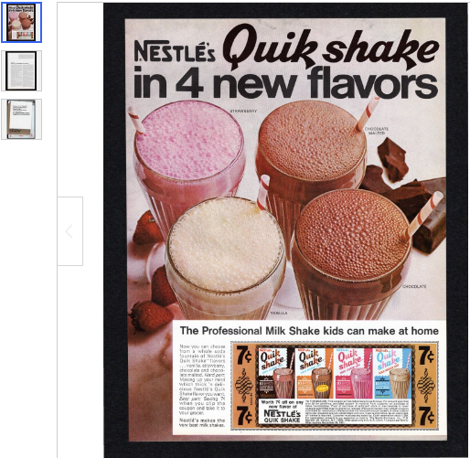
1967 Nestles Quik Professional Milk Shake Flavors Better Homes Gardens Print Ad

     After a good bit of prep work, and other projects to manage, it's finally time for my first actual post here.  Since "A Page Out of Time" is going to feature ephemera, and primarily from our eBay store, I wanted to start with something really appealing.  This one caught my eye pretty "Quik."  :^)

    I'm a child of the 60's, we always had a can of Nestle's Quik in the kitchen.  I loved chocolate the best, but it clumped a lot.  It was really hard to blend into the milk.  For convenience, even though it wasn't my favorite, I usually opted for Strawberry.  For some reason, strawberry blended better.  No clumping, and the milk absorbed the flavor better.  Now that I'm older, it's got me wondering if we were supposed to make it with a blender?  We always just spooned it into the milk, and stirred it with the spoon.  

    Seeing this old ad now, I'm also wondering why I never heard of the Chocolate Malted flavor?  Chocolate and Strawberry were practically permanently available.  Never tried vanilla, it seemed kind of redundant to add vanilla Quik to milk.  But Chocolate Malted?  That would have been popular.  Now I wish I'd tried it.  I would have been 7 years old when this ad was published.  That time, at that age, was exactly where my memories came from.  Seems odd that I never even knew about it.

    Anyway, this being my first legitimate post, I've included the full listing description here, including things that would become repetitive if I included them every time.  Also, the image has a link to the eBay listing.  Not sure if that's a good idea or not.  The link will only work as long as the eBay listing is live.  Once something's sold, I don't know if it'll become a dead link, or still connect to my store.  Guess we'll find out when it happens.  For now, if you click the image it'll go to this particular listing.  

    This is still a learning process for me.  Over time I hope to refine these posts.  We'll see how it goes.

Original Advertisement Page Placement: Interior

A single page, with both sides scanned and described.
Suitable for Framing

Ad Description/Company Name:
Side 1: Full Page, Color
Nestle’s Quik Shake in 4 new flavors
The Professional Milk Shake kids can make at home
Strawberry
Chocolate Malted
Vanilla
Chocolate

Side 2: No Ads on 2nd Page

Ad Type: Full Page
Publication Date: July 1967
Publication Name: Better Homes and Gardens
Magazine Size: Approx 9.5” x 12.5” (May be slightly smaller after pages are trimmed from magazine)

Condition: Used.
These are very old magazines, some in better condition than others. Foxing, fading, and discoloration may be present with older paper items. Minor corner damage and slight ripples may be present.
These are original pages taken from their original magazines.
Images are scanned on a Black background.
The images you see are the Exact same page being sold. I take detailed scans of each one, please examine and make your own judgment. Your satisfaction guaranteed!
Specific Condition Notes: None


Thursday, May 25, 2023

A Page Out of Time: Starting a New Blog

    Welcome to eBay Ephemera: A Page Out of Time.  My wife and myself have sold on eBay since 1999.  We've sold just about anything, from garage sale finds, to vintage, to antique items.  A friend once challenged me to sell my Lenticular Batman Popcorn Bucket from the Batman Begins movie... it sold for enough to pay for the movie ticket, popcorn, and drink.  :^)

    Monique's all business - she lists lots of things, fast, and knows their value.  Needless to say, she's been far more successful on eBay than myself.  I list things that have some personal appeal, and am often sidetracked by the history of the items I list.  Over the years, she's done quite nicely selling vintage and antique art, salvaged from books that would have otherwise been thrown away.  To give credit where it's due, we got started in ephemera with a how-to guide from Stuart Turnbull, Prints Make Profits.  Stuart's guides are the only ones I've ever bought that work.  We've followed his guides for vintage prints, and for altered art, with a lot of success, exclusively on eBay.  I've never done well on Etsy, even with Stuart's guides, but Etsy's a different beast and it just never made sense to me.

    Back to the point... Early 2023, I was listing some vintage Popular Mechanics magazines.  Monique remembered seeing vintage ads selling on eBay, did a little research, and suggested I sell the magazines by the ad, instead of by the book.  We've learned a lot since then, and I'm really enjoying selling the vintage ads.  My only problem is getting too interested in the product.  It's a fascinating view into history, especially regarding what was considered normal back then.  Some things are amusing, some eye-opening, and some just make me shake my head.  There's a lot of ads, even in major magazines, that are just... wrong, by today's standards.  I try to list as many each day as possible, but they're so fascinating it slows me down.  On the other hand, I really enjoy selling vintage ads, which means I'm much more likely to stick with it for the long haul.  

    On a side note, I've worked at a local newspaper for about 15 years, in the Classifieds section.  Last year I took early retirement, but am still at the paper part-time.  So, half the day selling advertising for the paper... then I come home to work with Monique, and I sell advertising on eBay.  I love being able to tell people I sell advertising at both jobs.  Only, one is advertising that has yet to print... and the other is advertising that printed sometime in the last century.  :^)

UPDATE:  I left the paper August of 2023, and am working from home with Monique now. We're both still selling on eBay to make ends meet!

    Some years ago, I had a fun little blog that featured some of the odd and interesting things we'd gotten locally and listed on eBay.  Actually, I had several blogs, but only two that I miss.  The first, a blog that featured southern gospel piano, was called "Grace Notes: Southern Styling on a Digital Piano."  It ran for about ten years, then stopped for numerous reasons.  You see it now as a live link, because I decided to recreate it.  The url, www.crewman6.com, has been mine for about 20 years.  If you'd like to find out what that has to do with anything, visit Grace Notes and read the "about me".

    The other blog I really enjoyed, and have decided to recreate, is this one.  Only this time, it's going to be focused more on ephemera.  I'll be featuring vintage ads here, with things that tickle my sense of humor, or amaze me, or just seem noteworthy in general. 
We'll both be listing ephemera on A Page Out of Time. I have the vintage magazine ads, she has multiple categories; post cards, altered art, vintage art saved from books that would otherwise be trashed.  
I'll sometimes list ordinary items on her store, Grandma's Trunk.  (See sidebars for links to both our stores.)

    She also came up with my new store name, "A Page Out Of Time", and made the Banner for the store.  Since this blog ties heavily into the same subject, the blog is titled after my store.  I like the synchronicity.  It all ties together, and I honestly couldn't imagine calling this blog anything else.